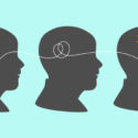
Human beings are hardwired to receive and make sense of visual information, explains Nicky Pasquier
The purpose of this article is to help you understand why visual content is incredibly powerful so that you can create more effective graphics and presentations.
When I first started my embryonic business back in 2013, I was an absolute nothing; I was the tiniest and most insignificant little fish in a very large pond. It was purely by chance that I learnt very early on that the key to being seen and heard online is creating eye-catching visual content. It really did work.
What Is Visual Content?
Visual content includes anything from the large banners you see at the head of social media profiles to images in your social media feeds, fun GIF files, presentation slides, diagrams, charts, screenshots, infographics, and animations. Its use on social media platforms has grown rapidly since images first started to appear on Twitter around 2014.
Since then, there has been an explosion of new social media platforms which are based solely on sharing images and videos. Think about the exponential growth of platforms such as Instagram, Pinterest and, lately, TikTok.
There are some interesting psychological reasons why we love to share content on these platforms. According to a survey conducted by the New York Times this year, 94% of people said they did so to “inform, amuse and help the people”.
The content we share also helps to define who we are, what we find interesting and what we care about. By sharing, we also nurture relationships and find other people with similar interests.
From a business point of view, visual content serves some even more interesting purposes.
I believe if you understand the ‘why’ of visual content, it will help you with the ‘how’ when creating it.
Humans Crave Visual Content
Human beings are hardwired to receive and make sense of visual information at a speed that is 13x faster than blinking. The ability to do so has ensured our survival.
I recall an episode from Michael Portillo’s railway journey through Australia when he was taken to view some Aboriginal rock artwork, dating back 17,000 years. It was explained to him that Indigenous people used drawings such as these to explain where the best water and food supplies were. So early man was already using visuals to convey information!
Back in 2015, I saved this beautiful infographic from NeoMam Studios, which is still relevant and neatly explains why human beings are hardwired to consume visual content.

Take a look when you have time; it’s fascinating.
Understanding and Memory
Studies have found that people can remember 80% of the content they’ve seen compared with 20% they’ve read and just 10% of what they’ve heard.

(10 Reasons Why Visual Content Marketing Works – NeoMam Studios)
However, simply combining pictures with text increases memory retention and understanding by a further 55%.
No wonder, then, that infographics are shared more than any other piece of visual content. They can transform what would otherwise be rather dull and boring data into visually appealing, memorable graphics that people want to share.
Emotional Connections
Have you ever watched one of those heart-breaking TV adverts often shared by charities? They present you with images of children suffering from dreadful malnutrition, or of animals being mistreated. The videos end with an opportunity to donate money (a ‘call to action’) via a website or text message to help relieve their suffering.
For those of you in the UK, we see this tactic being used every year on Red Nose Day, or Children in Need. We’re shown some truly heart-rending images on the screen for a few minutes, followed by a ‘call to action’ to donate money. This year a total of £42.79 million was raised!
Charities successfully use images, often in the form of video, to trigger emotional responses.
It works because visual memory is encoded in the same place where emotions are processed.
Clever, isn’t it?
But the key is if a business understands how to use visual content to connect with its audience at an emotional level, it can almost certainly move them into taking the desired course of action. For that, the business really needs to know its audience very well.
Mobile Friendly
Over the past 10 years, life has become increasingly frenetic. We’re constantly rushing here and there, to and from meetings, hot-desking, travelling, and working all hours. When it comes to consuming information, the last thing people want to be presented with is a wall of text.
Firstly, we generally don’t have time to sit and read an entire article. Users have been found to read just 20% of a web page, for example.
Secondly, text on its own is just boring, isn’t it? I’d much rather look at an image or a video.
The third thing to consider is that, since we’re on the go so much of the time, we tend to use mobile devices to consume information.
In fact, you can see from the image from Oberlo below that 59.4% of all web traffic now comes through mobile phones compared with desktops.

So, visuals are well suited to our busy lifestyles. They’re easier to consume on the go via our smartphone devices, and quickly convey messages without the need for paragraphs of text.
Think about the recent explosion of vertical videos such as Instagram Reels, YouTube Shorts and TikTok videos, which have all come about because of the increased use of smartphones.
When you put all this information together, you can see why more and more marketers are making visual content a priority.
Not only are visuals engaging and easy to digest, but they’re also perfect vehicles for sending ‘bite-sized’ messages that can be understood and remembered. They’re perfectly suited for viewing and sharing via our smartphone devices.
Visual Content for Business
When it comes to creating visual content for business, there are a couple of key things to remember.
Branding
Always maintain a consistent visual brand style. This means weaving your own brand colours, text, logo and even your brand personality into visual assets. Don’t be tempted to chop and change these around, like I used to do. I’m a sucker for beautiful fonts and I used to change them with the wind when I first started out.
To ensure that all your visual assets are always ‘on brand’, set up your own brand’s visual style using Canva’s brand kit. You will need Canva Pro to create a professional brand kit. If you don’t already have a Pro account, feel free to test out all the premium features with a free 45-day trial. [Disclaimer: This is my Canva partner link, for which I receive a small financial bonus if you subscribe to Canva Pro after your free trial. You are under no obligation to use this link.]
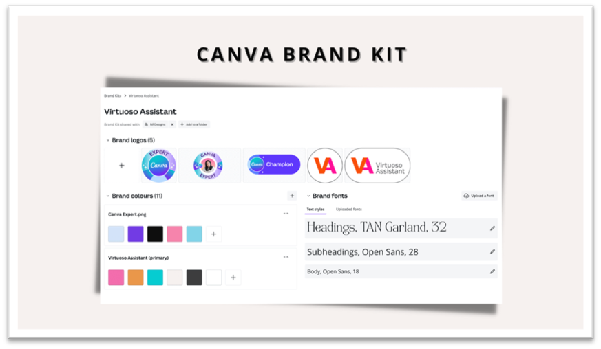
Once you have your brand kit set up, you’ll be able to upload your logo(s), save your brand colours and upload custom fonts, if necessary, so that they’re all easily accessible from within a design.
Canva now allows you to create multiple brand kits, which is invaluable if you are a Virtual Assistant and work with different clients. Swap from brand kit to brand kit whilst designing with just one click of your mouse.
Images
Ensure that all the images you use are aligned with your brand personality (your marketing department will almost certainly help you with this if you’re unsure).
Also, ensure that images aren’t blurred or pixelated; they need to be high resolution. High-res images tend to be large files, so if you need to compress them for use online, then I’d highly recommend using Tiny.png, a free tool I’ve been using for years.
Visual content that’s going to be shared on social media needs to be eye-catching enough to ‘stop the scroll’!
With that in mind, use a relevant but arresting image that will initially grab attention. You might want to incorporate a little humour with your image, something strikingly beautiful (think exotic holiday destinations) or, dare I say it, something slightly shocking.
I don’t advocate being rude, but sometimes being a little risky with your content can not only be rather funny, but also make it memorable (see below)! I discovered Jesse Desjardins’ slide deck on SlideShare back in 2014 and I’ve always remembered it.

Once you’ve chosen the correct image to use, you’ll probably need to add some text overlay.
I don’t recall who gave me this piece of advice years ago, but it’s incredibly helpful:
“Imagine you’re speeding along a motorway. You see an advertising board and you have only seconds to read the message before it’s gone. The likelihood is that you’ll only have time to see the main picture, a heading and possibly a bit of text underneath.”
This advice is so helpful when creating social media images, and also presentations.
The main heading or line of text should add context to any image you use and hold your audience’s attention. Use 2 to 4 words, maximum.
If you have space underneath, add a further line of explainer text and, where relevant, include a call to action.
Refer to my graphic (a) below, by way of example.

Marrying text with images
Combining images with text can be tricky. Very often I see far too much text on a graphic, which is off-putting and runs the risk of losing an audience’s attention immediately.
However, you’ll not go wrong if you remember that, in design, less is more.
Don’t be afraid to give the various elements, like text and pictures, space to breathe. Don’t feel you need to cover every piece of white space available.
Try to use an image which has some ‘clean space’ on which to add text, like my graphic above (a).
If you have no choice but to use a rather busy picture, then use a text box, which will help the text stand out from the background (b).
Make the text ‘pop’ even more by adjusting the brightness or even blurring the background image a little.
Balance
A well-balanced graphic is key when it comes to design.
I quickly created the image below because it seemed the easiest way to show you how I’ve not only used the sky as a clear space on which to put some text, but also used the text to balance the overall composition of the image so that it isn’t bottom heavy.
It’s a neat little trick, it’s easily done, and it can make a graphic look much more professional.

All these effects can be easily achieved, of course, within Canva. If you’re not feeling terribly creative, then use one of the thousands of templates available in the Canva library. And if you regularly design presentations, I’d highly recommend you take a look at Canva’s new presentation layouts.

They will help you quickly build the ‘skeleton’ of a presentation using a selection of pre-formatted slide templates. You will also find that the text is the recommended size for each section, and image placeholders are in the best position.
All you have to do is flesh out the slides with your own content and change the branding using your brand kit. Perfect!
Summary
There is so much more that I’d love to tell you about, including how to make compelling graphics and presentations using animations, transitions and video. Video is incredibly persuasive. In fact, according to Wordstream, “Including a video on your landing page can boost your conversion rate by up to 80%”.
Tools like Canva make incorporating videos into graphics and presentations easy. It’s even possible to embed a YouTube video into a presentation.
I do hope this article has been interesting and has helped you understand why visual content is such a powerful marketing strategy. If there is anything you’d like to ask me, please don’t hesitate to drop me an email; I’m more than happy to help.