
Can everyone read your documents? Are they accessible? asks Shelley Fishel
When you are composing a document and using Microsoft Word to transcribe it, do you wonder whether everyone can read it?
Most of us assume that the documents we create can be read by anyone. We all use decent fonts and good spacing and set out documents well.
But what if there are people in your organization who consume your content that have a visual impairment? Perhaps they do not shout about it or want anyone to treat them differently.
They may be blind or have other conditions that affect the way they see things – like dyslexia. Or maybe they have a learning or reading disability.
If a blind person is reading your document, they may be using a screen reader, which means they are in fact listening to your document!
How can we ensure that the documents we create can be accessed by everyone?
There are several things to consider, aside from the language we use.
Who is the intended audience? Is anyone using a screen reader when accessing this document? Or are they dyslexic and so the layout fonts and style will have an impact on how they read and understand what we have written?
What Does a Screen Reader Do?
A screen reader will be used by someone who is blind or has a severe visual impairment. It is a software program that the IT department will set up. The reader will access the document via a headset and, using key commands, will move through the text.
The screen reader reads the text aloud at a speed set by the user. Not only does it read out the text, but it also reads the line breaks and spacing!
Using keystrokes, the user can go back and re-listen to sections of text that they may have missed.
Just think about the sheer amount of processing that is going on for this reader. I once sat with a blind lady at her desk to help her with some Microsoft Word features. She was keen to understand Styles and formatting to better help her colleagues give her data and documents that she could read. It was a truly humbling experience. This lady had a lovely guide dog who sat under her desk, and she had to ask someone to guide her to the toilets as and when.
It could take her a while to read and respond to documents or emails, as everything had to be read by the screen reader. When she was composing a reply, she had to use the screen reader to read her writing back to her before sending it off. However, the fact that she was blind in no way meant that her mind was impaired!
It All Begins with Style
If you have experienced any of my Microsoft Word training, you will know that I am keen on using Styles. However, before we get into that, let’s take a moment to consider what you need to think about before you get started.
Document structure
It is important to think about the structure of the document, and Styles will enable you to do this. By applying Styles to headings in the document, you are enabling anyone using a screen reader to listen to a heading and choose to skip if need be.
Much like you would use a Table of Contents to jump to different sections that are relevant to you, so someone using a screen reader can use the keystrokes to skip a heading.
Fonts
Begin with the fonts that you or your organization choose. You may have no choice in this if you have a brand style that the organization insists on; however, it is worth checking out if the brand style is accessible, and if there are alternative fonts that can be used.
Use fonts that can easily be read by everyone. Some fonts are more difficult to read than others. Handwriting fonts, for example, can be notoriously difficult to read (a bit like my own handwriting).
Italics
Italics can also be hard to read; the slant of the letters can be confusing for someone with a spatial issue. Think about using quotation marks for emphasis instead of italics.
Capital letters
Use ALL CAPS sparingly; it is like shouting, and no one likes to be shouted at.
Paragraph length
Make sure to chunk your paragraphs. Shorter paragraphs – up to about 7 sentences – are best. These are easier to read, as the document is spaced out.
Consider setting your paragraph spacing to include space after the Enter key is pressed. This serves two purposes: one, your paragraphs are spaced better, and two, you only need to press Enter once! Makes for faster typing once you get used to it.
Colour contrast
If you must use colour in your document, be that to change the font colour or to add shading for emphasis, make sure to consider the colours you use. Remember, use dark fonts on a light background and lighter font colours on a darker background.
Pictures, graphics, tables and charts
These all need ALT text (ALT = alternative).
ALT text is hidden text that can be read by a screen reader to describe the image to the reader. It should be added to all the different kinds of images you add to the document.
How to add space between paragraphs
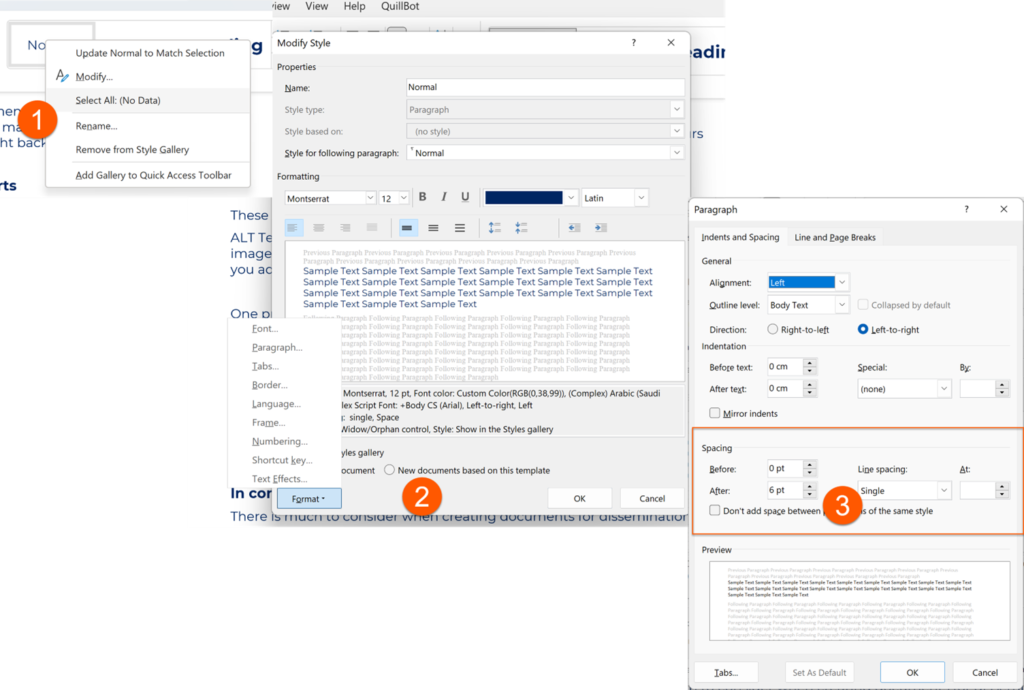
One practical tip to take away is how to add Space After to a paragraph. For example, I always have 6 points after every paragraph. This ensures that I only need to press the Enter key once after each paragraph and eliminates the need for two line spaces between paragraphs.
To add Space After – right-click the font (1) – in this case I will modify the Normal font – and choose Modify.
Then click on the small button bottom left and select (2) Paragraph. Next set the desired point size to follow after a paragraph (3).
Note that there is a checkbox underneath the spacing area labelled “Don’t add space between to paragraphs of the same style”. Only check this for styles like Bullets or Numbering. Otherwise, it will not add the spacing required!
How to Check If Your Document Is Accessible
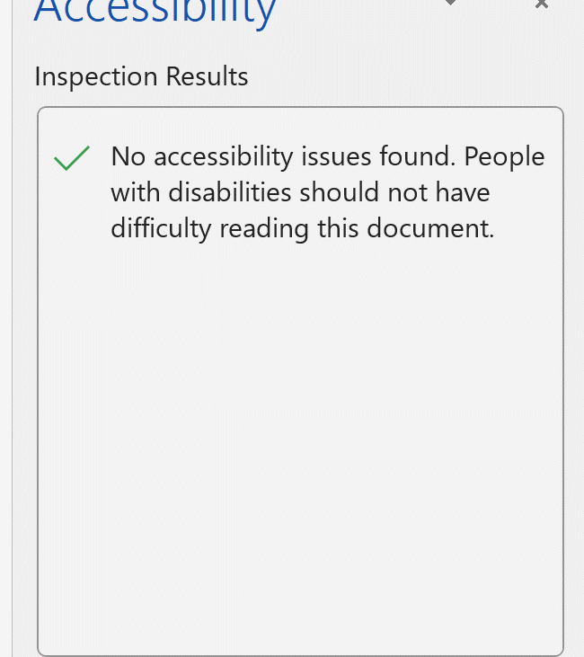
Did you know that Word has a built-in Accessibility Checker? Microsoft has been doing a lot of work in the areas of inclusion and accessibility and has added the Accessibility Checker throughout Office.
Get to it via the Review Ribbon:
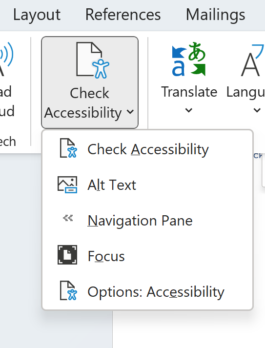
Click on Check Accessibility and a task pane will open on the right-hand side of the document. Here you will find highlighted anything that it considers inaccessible.
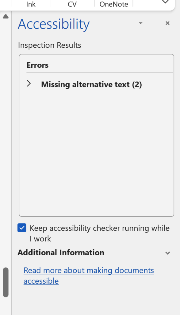
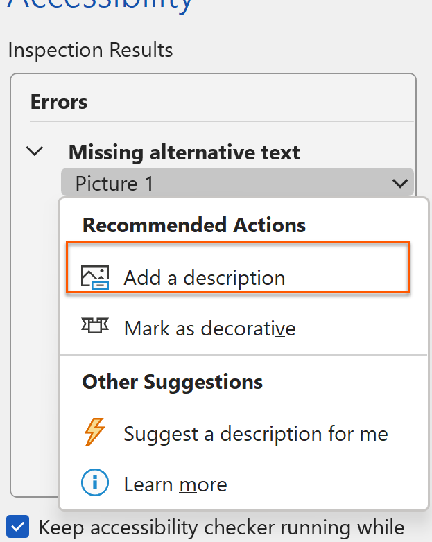
As I have launched it for this document, you can see that it is telling me that I am missing alternative text on two images. I can expand the list to jump to each image and add the alternative text here.
Once all the alternative text has been added and any other corrections made, the Accessibility Checker will confirm this.
If the Accessibility Checker finds other errors, such as unclear fonts or extra line breaks, it will tell you and prompt you to make changes.
In Conclusion
When creating documents that are to be consumed by many and varied people within and without your organisation, you need to consider not only what is written but also how it is presented.
By creating documents that are accessible through using easily readable fonts and structuring your document well, you will be creating documents that are accessible to more people and transfer well to online formats.
What Will You Do Differently?
Were you aware of the Accessibility Checker? Had you consciously thought about the fonts and styles you use and the use of spacing in your documents?
What will you do differently now that you are more aware?