
Traci Williams offers useful formatting tips for your Excel spreadsheets
Spreadsheets don’t always look very exciting, or appealing. They’re usually in black and white and look like they’re going to be hard work for us to work out what the important information is.
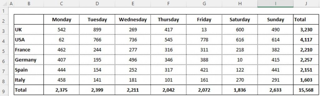
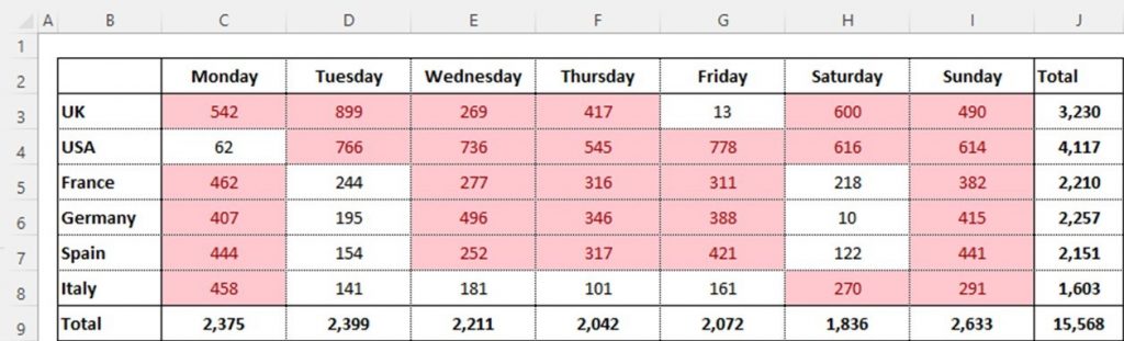
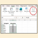
When we view the data in the screenshot below, it doesn’t look very interesting. We need to look at it all in detail to understand what it is telling us:
But this doesn’t have to be the case; there are lots of tools we can use to help relevant information stand out.
Conditional Formatting
Conditional formatting is a tool that can be set up to be applied automatically based on the data itself. This not only saves you time, removing the need to edit manually, but also increases the accuracy, making the data even more reliable.
There are lots of ways we can apply the conditions, and lots of formats we can use too, so this article will explore a selection of them.
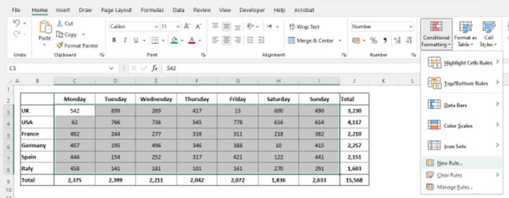
I always recommend selecting the data to which you want to apply the conditional formatting as the first step. Then, from the ‘Home’ ribbon, select ‘Conditional Formatting’:
Highlight Cells Rules
The first option on the Conditional Formatting menu is: Highlight Cells Rules. This can be used to highlight any cells with specific values (relating to text, numbers or dates).
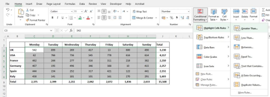
Select ‘Greater Than’ from this list:
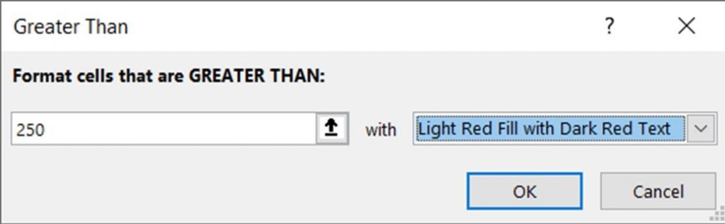
Manually enter the ‘Greater Than’ value required (into the box on the left), then select the format (in the box on the right). There are some predetermined formats to choose from, but you can also select your own using ‘Custom Formats’ too.
This will then make the data appear as follows:
Top / Bottom Rules
From the ‘Conditional Formatting’ menu, select ‘Top / Bottom Rules’:
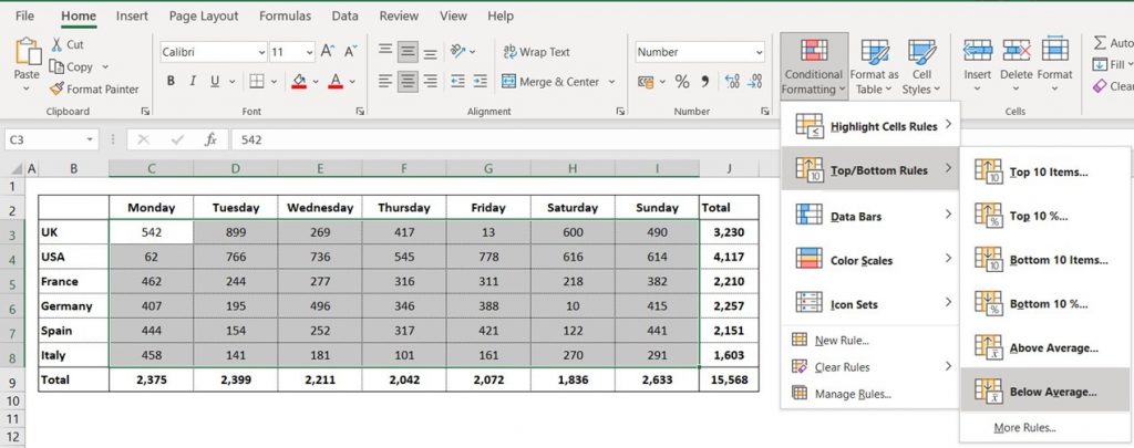
Then choose ‘Below Average:
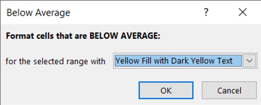
The only selection to be made here is the format to be applied, and as above, there are some predetermined formats to choose from, but you can also select your own using ‘Custom Formats.’
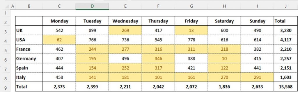
This will then make the data appear as follows:
Data Bars
With this data, I would only apply Data Bars to the total cells to make them more meaningful.
From the ‘Conditional Formatting’ menu, select ‘Data Bars’:
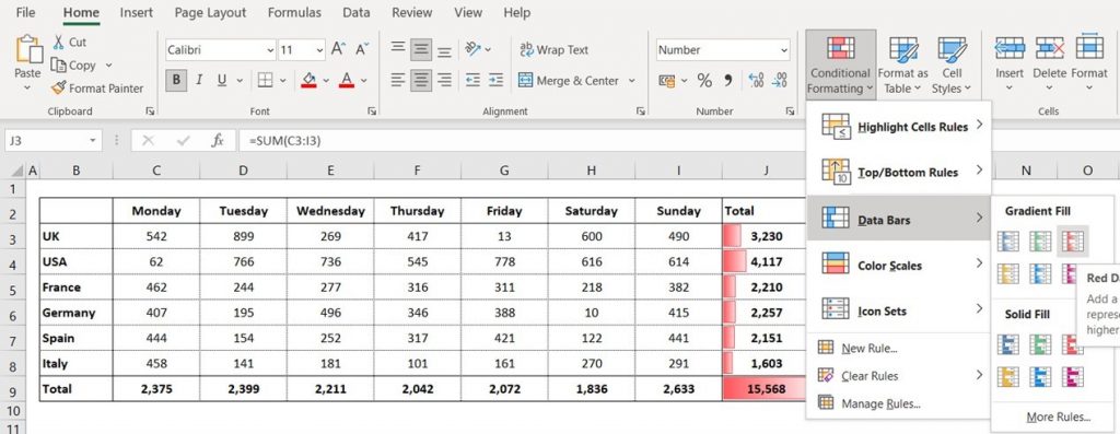
Then select the preferred fill type (solid or gradient) and colour.
This will then make the data appear as follows:
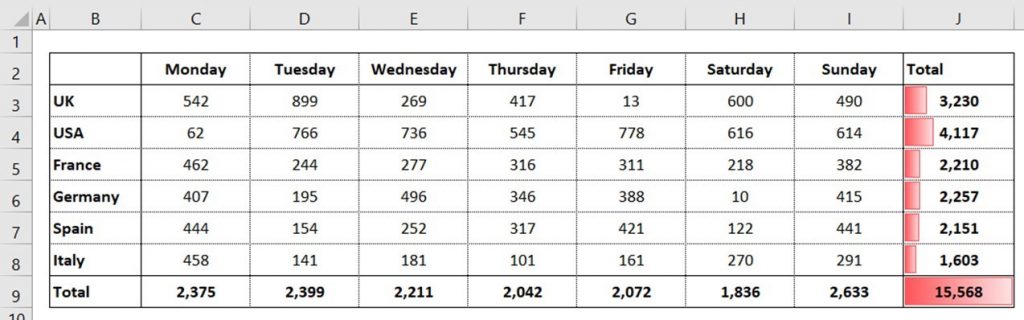
The data bar is based on the % of the total that each value represents (i.e., the longer the bar, the higher the value).
Color Scales
From the ‘Conditional Formatting’ menu, select ‘Color Scales’:
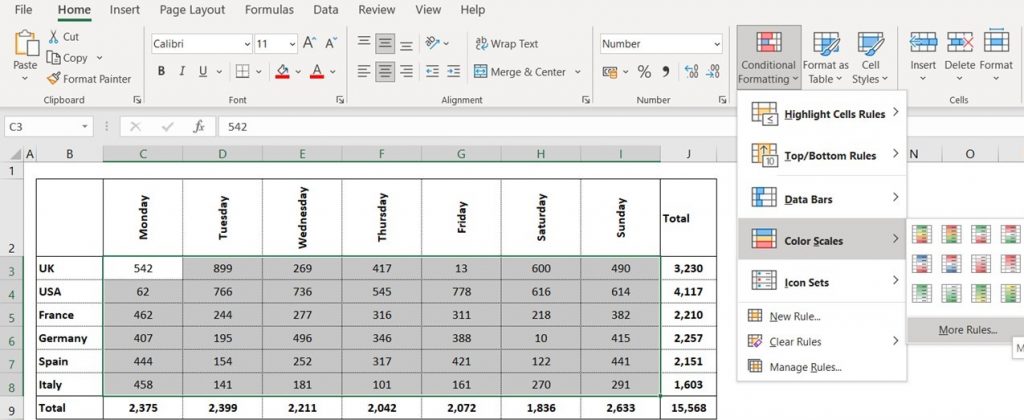
Then select the preferred colour scale.
This will then make the data appear as follows:
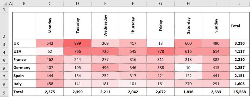
The lower numbers will be the palest colours, and the darker shades of red represent the higher numbers.
All the above options represent shortcuts to setting up the conditions (or rules).
Manual Rules
Conditional formatting can also be applied by manually setting the rules by selecting ‘New Rule’ from the Conditional Formatting list:

At the top of this list are the rule types to select from, and at the bottom are the rule descriptions (i.e., conditions) and formats.
The rule descriptions will change depending upon the rule type selected.
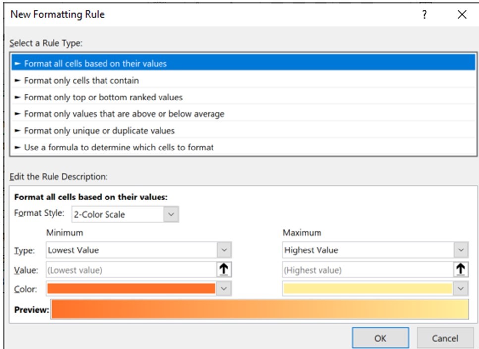
If you review these rule types, you’ll see that they are similar to most of the shortcuts described above… this is just an alternative method of setting them up.
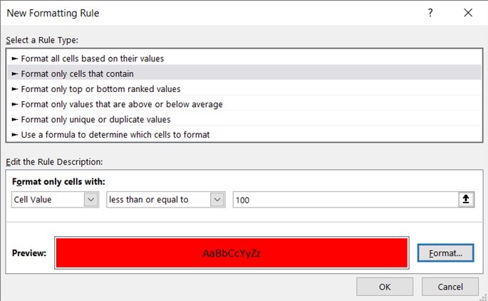
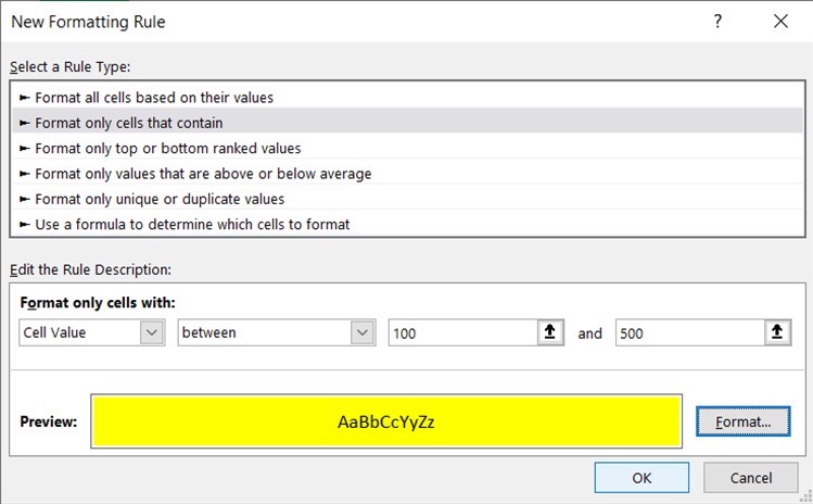
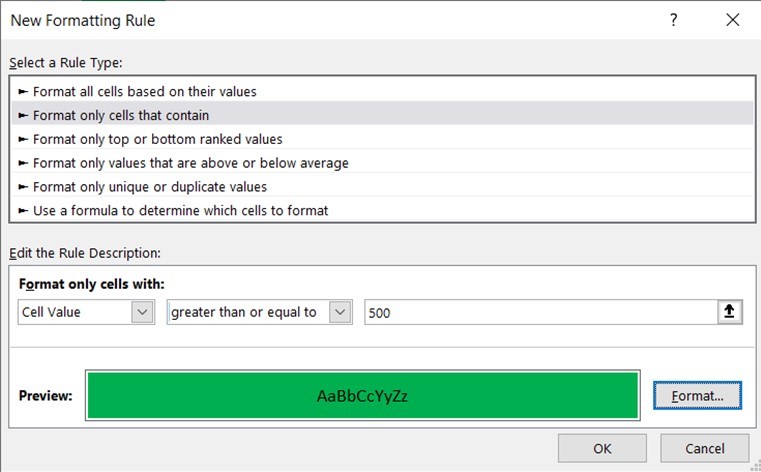
Select the rule type: ‘Format only cells that contain’:
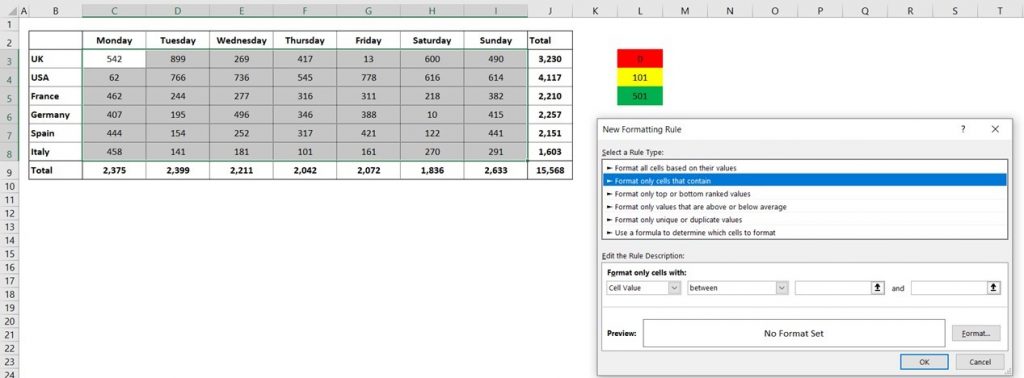
This rule type can be used to set up three separate rules, as per the ‘key’ on the sheet:
Red: From 0 to 100
Amber: From 101 to 500
Green: 501+
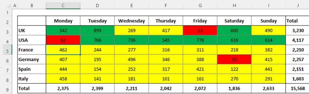
This will then make the data appear as follows:
All these rules can also be linked to the specific cells contained within the key on the sheet, giving the user the ability to adapt the scale without needing to edit the conditional formatting rules.
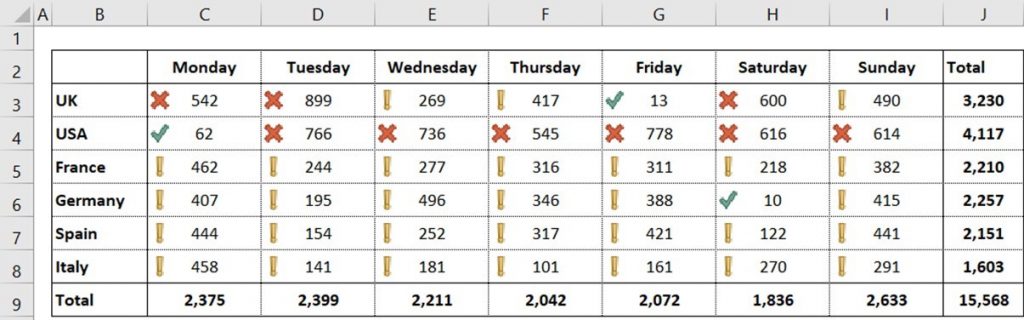
Icons
From the ‘Conditional Formatting’ menu, select ‘Icon Sets’:
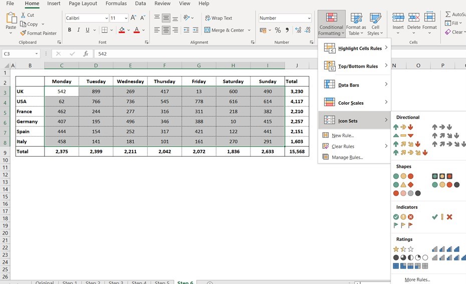
Then select the preferred Icon Set.
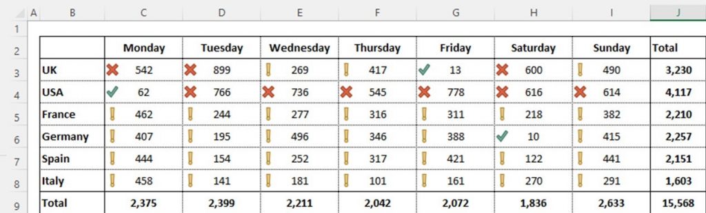
This will then make the data appear as follows:
Manage Rules
The trouble with Icon Sets is that the rules being applied are not always as logical as all of those above, so they may or may not make sense.
Therefore, it is important to know how to manage the rules.
This is the same for ALL rule types, but it is more necessary for the Icon Sets.
From the ‘Conditional Formatting’ menu, select ‘Manage Rules’:
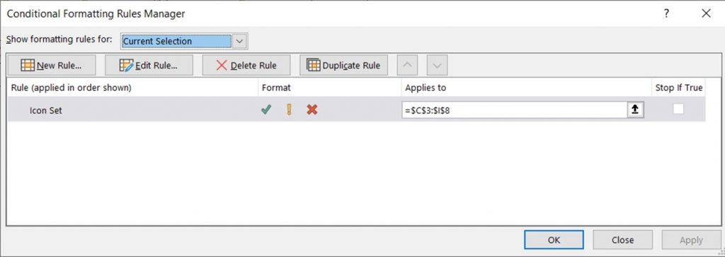
A list of ALL rules will be shown for the currently selected cells.
NOTE: If this is empty, amend the filter at the top of this screen from ‘Current Selection’ to ‘This Worksheet.’
The range that the rules are applied to can be amended on this screen by editing the ‘Applies To’ section. This is really useful if the range increases.
To view or edit the rule, select ‘Edit Rule.’
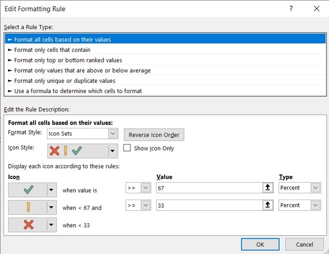
The above rule states that the green tick will be applied when the value in the cell is greater than or equal to 67% of the total for the range.
If we wanted the icons to be in line with the ‘key’ on this sheet, we would need to amend the rules as follows:
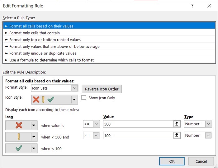
Then click OK. This would make the data appear as follows:
Adopting some of the suggestions above will make your spreadsheet visually more appealing and help the relevant information stand out.


thank you very useful
will try them out
Sarah x
Enjoy Sarah! 😉
Thank you, we will practice