
Excel can be a powerful ally in creating charts and graphs that not only communicate data but also tell a compelling story, says Traci Williams
In the dynamic role of an Executive Assistant, conveying information clearly and effectively is paramount. Excel, with its robust charting and graphing tools, can be a powerful ally in creating presentational charts that not only communicate data but also tell a compelling story. This article aims to guide Executive Assistants in leveraging Excel’s chart and graph features to craft presentations that stand out.
Understanding the Basics: Types of Charts and Graphs in Excel
Before diving into the creation process, it is important to understand the various types of charts and graphs available in Excel:
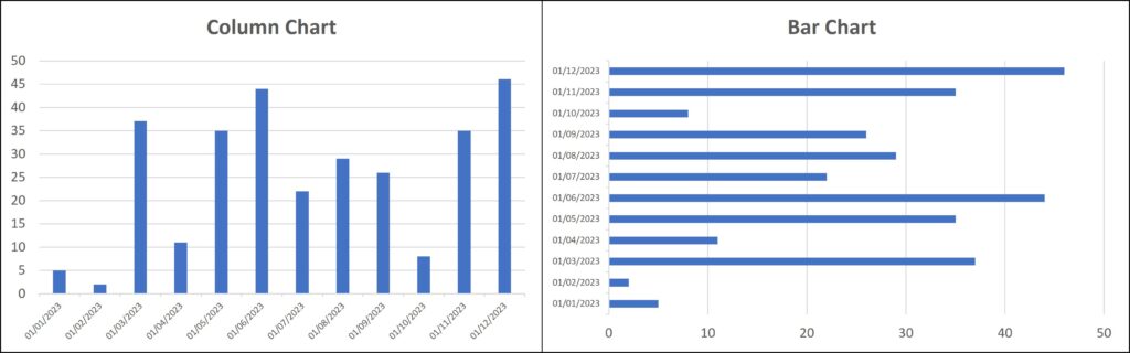
1. Bar and column charts
Ideal for comparing different groups or tracking changes over time.
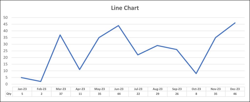
2. Line charts
Perfect for showing trends and progress over intervals.
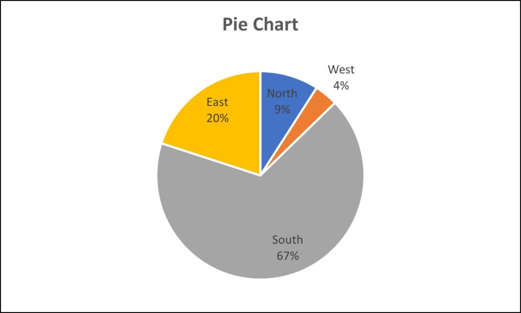
3. Pie charts
Best used for showing parts of a whole.
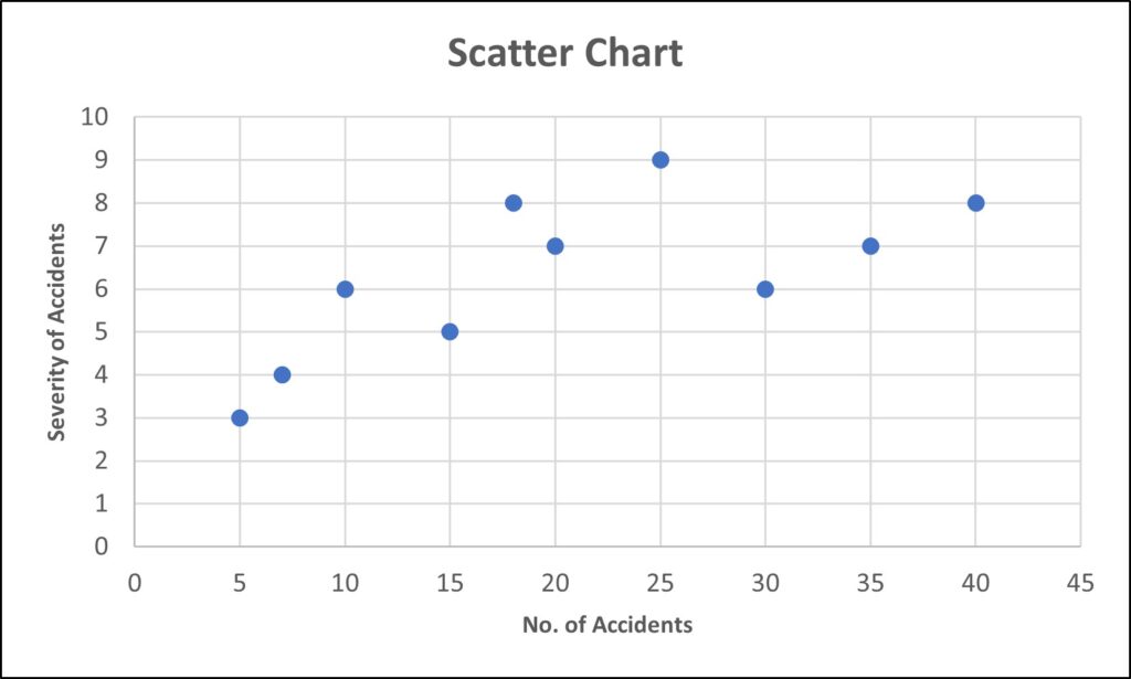
4. Scatter plots
Excellent for demonstrating relationships between two variables.
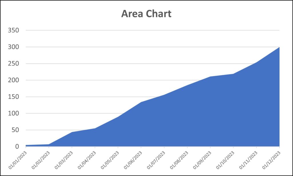
5. Area chart
Useful for showing cumulative totals over time using numbers or percentages.
Step-by-Step Guide to Creating Charts and Graphs
1. Selecting your data
Start by highlighting the data in your Excel worksheet that you want to represent graphically (or you can use a Named Range, which makes it easier to update the range in future).
2. Inserting a chart
Go to the ‘Insert’ tab and choose the type of chart that best fits your data (from the Chart section of the ribbon).
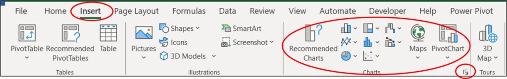
Tip
Click on the ‘arrow’ icon on the bottom right of this ribbon to go to the Chart Menu and access both Recommended Charts and ALL chart types.
3. Customizing your chart
Once the chart has been created, you can customise it as follows:
- Title and Labels: Add a clear, descriptive title and label your axis. In the ‘Scatter Chart’ above, you can see how the axis labels provide more meaning and clarity to the chart.
- Colour and Style: Customize the colours and styles to make your chart visually appealing and aligned with your presentation theme.
- Data Labels: Where necessary, add data labels for clarity. In the ‘Pie Chart’ above, you can see how the data labels provide more meaning and clarity to the chart.
- Data Table: Where necessary, add data tables for clarity. In the ‘Line Chart’ above, you can see how the data table provides granular detail to support the chart.
To make any of the above changes to the chart, you can use the ‘Chart Design’ ribbon that appears when the chart has been selected:
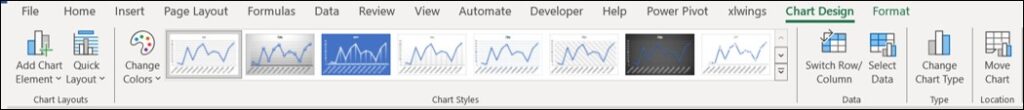
The ‘Chart Styles’ section provides lots of beautiful pre-designed options for you to select from, and the option to change the colour palette for the chart.
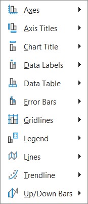
The first icon on the left, ‘Add Chart Element’, provides a list of simple-to-use options to add titles / labels / tables, etc., as follows:
You can edit any element on a chart by left-clicking to select it and then right-clicking to access a context menu. The last option in this menu is always ‘Format [Element]’, where ‘[Element]’ is the name of the selected item (e.g., ‘Format Axis’). Selecting this opens a panel on the right side of the screen with all available options.
Tips for Effective Chart and Graph Design
- Simplicity Is Key: Avoid clutter. Too much information can be overwhelming.
- Consistent Style: Maintain a consistent style throughout a presentation for a professional look.
- Use Colours Wisely: Use colour to highlight important data points but avoid overly bright or clashing colours.
- Legible Text: Ensure all text is easy to read and understand.
- Context Matters: Always provide context for your data to help your audience understand its significance.
Advanced Features to Enhance Your Charts
1. Combining chart types
Sometimes combining two different types of charts, like a column and a line chart, can provide a clearer picture of your data:
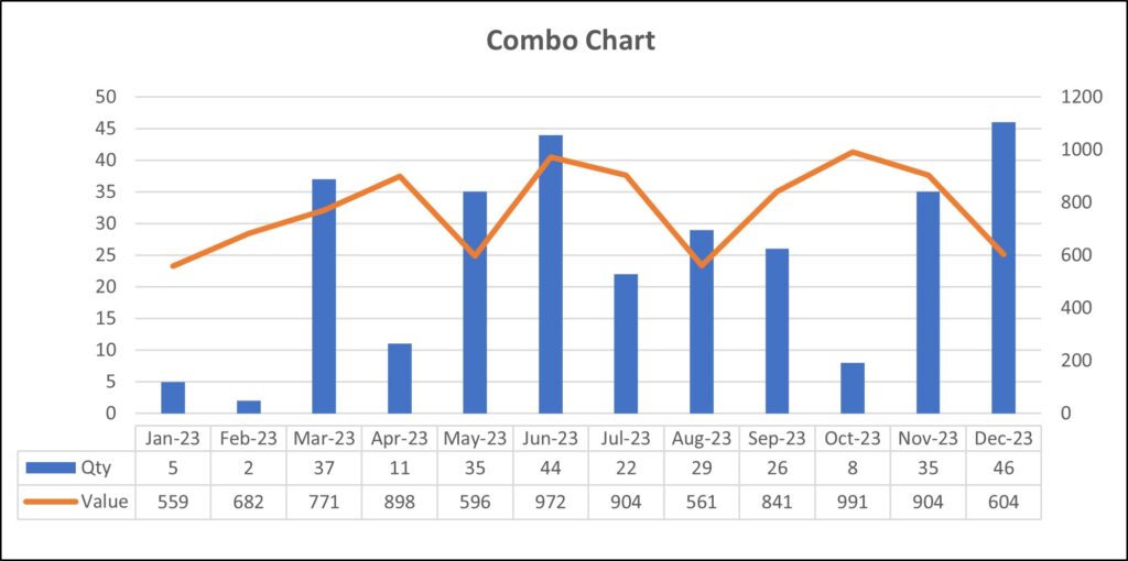
The above chart also has the data plotted on two separate axes, as the scale is so different for the two sets of data.
2. Using Pivot Charts
Pivot Charts are dynamic and can be a powerful tool for Executive Assistants dealing with large datasets, as when the underlying Pivot Table data changes, the Pivot Chart automatically updates. They are typically far easier to update and edit by simply dragging and dropping the fields.
Since Pivot Charts are linked to Pivot Tables, they maintain consistency and accuracy in data representation, minimizing the risk of errors that can occur with manual chart updates.
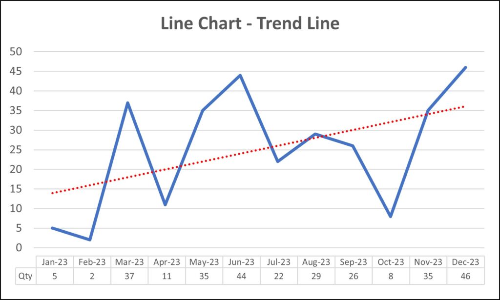
3. Adding trendlines
For line charts, a trendline can help in forecasting and showing patterns.
Presenting Your Chart in a Meeting
- Narrative Matters: When presenting, do not just show the chart; tell the story behind the data.
- Prepare for Questions: Be ready to answer questions about your data and analysis and explain any anomalies that will be easily visible.
- Practice Makes Perfect: Rehearse your presentation to become familiar with the flow and how the charts contribute to your narrative.
Conclusion
As an Executive Assistant, your ability to present data engagingly and insightfully can make a significant difference in decision-making processes. Excel’s charts and graphs are not just tools for displaying data; they are instruments for storytelling. By mastering these tools, you can create impactful presentations that resonate with your audience and effectively communicate key messages.
Remember, the best presentations do not just deliver data – they connect with the audience on a deeper level, making complex information easily digestible and actionable. Excel is your partner in this endeavour, offering a range of features to bring data to life in the most impactful way possible.


Quite impactful and informative are Traci Williams presentations. Keep it up!
Great to hear, thankyou for the feedback! Traci