Traci Williams shares her Excel expertise and unlocks the mysteries of Pivot Tables and Pivot Charts
What Are Pivot Tables?
Pivot Tables summarise large (or small) data sets, in any way you like, and make it much quicker and easier to manipulate data without any risk of impacting the raw data.
The word ‘Pivot’ indicates that data can be shown in a large variety of different ways, so you can build one report, then within a few clicks have it transformed to show you something completely different. This was a life-saver for me when my executive used to ask: ‘Could I just see the data this way?’
Here is an example spreadsheet:
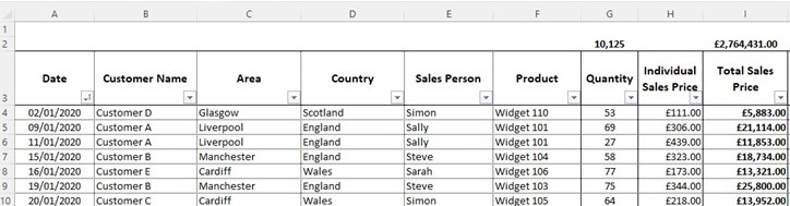
This spreadsheet is great for collecting our data, but all it gives us is the totals for the columns. Of course, we can apply filters and the totals will update (as I’ve used the Subtotal formula, instead of Sum), but that would require a lot of filtering and remembering numbers.
So, this is a perfect example of where a Pivot Table would be useful.
Top Tips for Data
Before we dive into a Pivot Table, I will give you a few top tips:
- Make sure every cell on the header row (row three in this instance) contains a value (text, number, date, character) and is not empty.
- Make sure you’re happy with the headers of the columns, as changes to them later may affect the Pivot Table.
- Give your data a Named Range and use this as the basis for the Pivot Table. It makes it easier, quicker and more robust if you have multiple Pivot Tables and the data range changes. This is not essential; you can use Pivot Tables without Named Ranges, but I highly recommend using them!
Creating a Pivot Table in Excel for Windows
- From the Insert ribbon, select PivotTable.
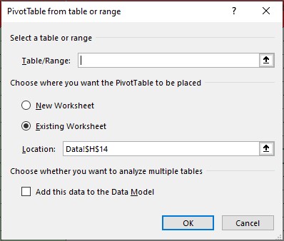
- In Table/Range, enter the cell range (navigate directly on the spreadsheet) or Named Range (press F3 for list of Named Ranges).
- Select New Worksheet or Existing Worksheet (for Existing Worksheet, select the location where you want the PivotTable to appear).
- Select OK.
Our PivotTable will appear as follows:
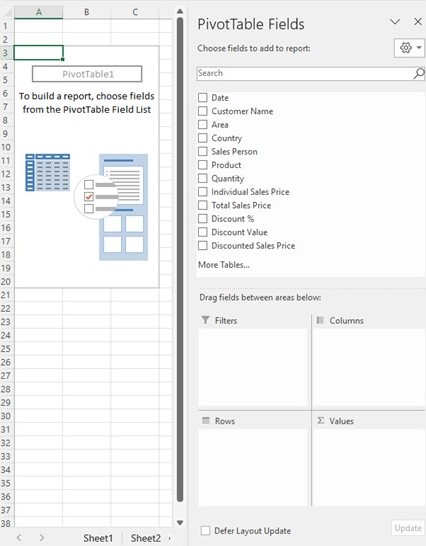
On the left-hand side is the Pivot Table Report (currently empty).
On the right-hand side is the Pivot Table Field List.
The top section of the Pivot Table Field List is the list of Fields (as per the Header row in the raw data). The bottom section contains the Report Areas, and the Fields can be dragged and dropped and will instantly appear in the Report (on the left).
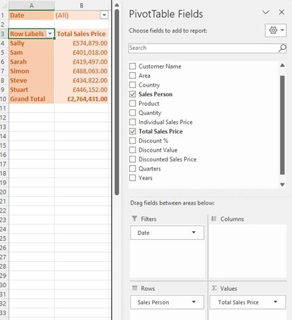
Here is an example of how this could look:
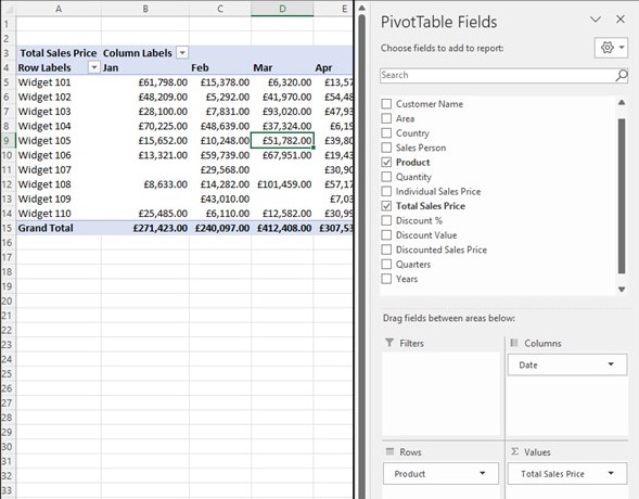
In this example, the Pivot Table has summarised the Total Sales Value of each product, by Month.
Note that the Grand Total is also the same as the total for the column in the raw data. This is how we can verify and have confidence that the report is correct.
The fact that this is a ‘Pivot’ Table means that we can quickly and easily change the report with a couple of clicks (to appease your executive’s ‘Can you just…?’ request), like this:
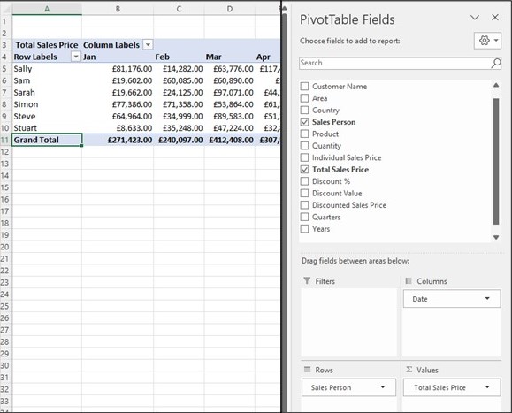
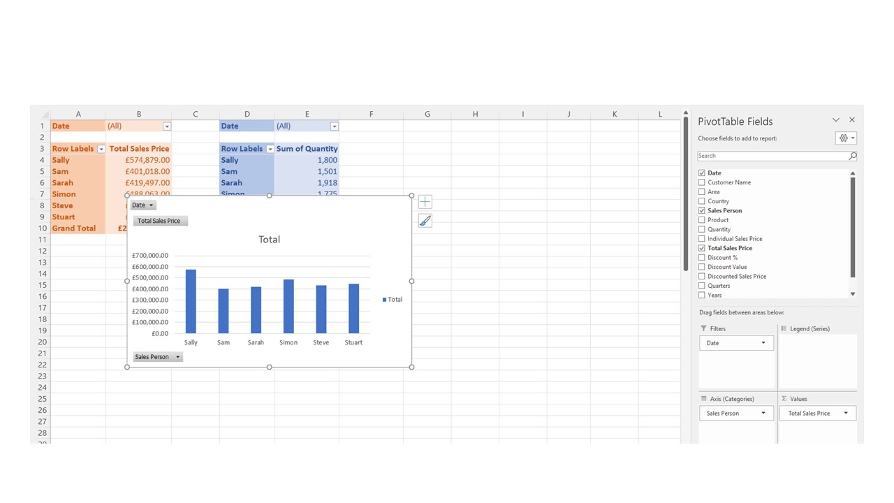
In the example above, you’ll see that the ‘Product’ field has been swapped in the rows area for the ‘Sales Person.’ The report still shows the same ‘Grand Total,’ but this has now been split by Sales Person and Month instead of Product.
We could also leave both the Product and Sales Person fields in the rows area too:
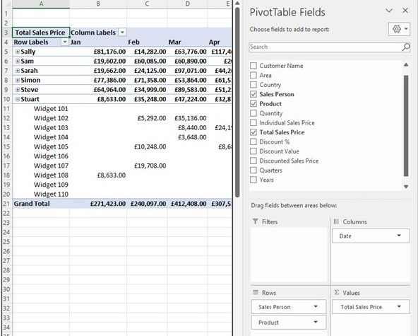
Please note that there is a ‘+’ or ‘-’ symbol alongside each Sales Person, so we can expand or collapse the section to drill down into the related Products. This saves needing to generate multiple reports and gives the user the ability to see more (or less) information at the touch of a button.
Pivot Table Styles
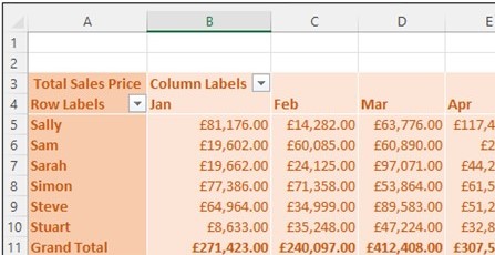
One of my favourite features of Pivot Tables is the ‘PivotTable Styles.’ There are so many to choose from, and they look different with each Pivot Table Layout too.
1. Click anywhere in the PivotTable to show the PivotTable Tools on the ribbon.
2. Click Design, and then click the More button in the PivotTable Styles gallery to see all available styles.
3. Pick the style you want to use.
If you don’t see a style you like, you can create your own. Click New PivotTable Style at the bottom of the gallery, provide a name for your custom style, and then pick the options you want.
I tend to use spreadsheets by colour, and this is a perfect tool to help me do just that:
We can also use the ‘Filter’ area of the Pivot Table, where we can select a specific section to include in the Pivot Table, such as month:
Per the example above, I’ve simply dragged the ‘Date’ field into the filters area of the report (from the columns area). The Pivot Table now shows data for ALL months, but this could be drilled down by selecting a month (or multiple months) from the Filter pick list.
It’s also possible to create multiple Pivot Tables linked to the same raw data, and this way you eliminate any reconciliation issues:
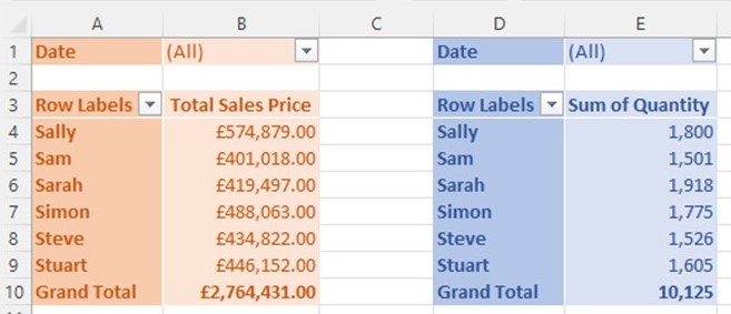
Pivot Tables can either be created individually or (the easier and quicker way) by copying and pasting an existing Pivot Table. If Pivot Tables are linked to the raw data using ‘Named Range,’ if the data range should change, once the Named Range is amended, ALL Pivot Tables (linked via Named Range) will automatically update, requiring no further manual intervention.
However, if Pivot Tables are linked to the ‘Absolute Cell Reference’ (i.e., Data!$A$3:$L$201), then the data range will need to be manually amended on EVERY individual Pivot Table, EVERY time the range changes.
Pivot Tables can also be stored in the same sheets, or separate sheets, or even in a whole different file to the raw data. This gives huge flexibility if you want to send the Pivot Table Report, but not the underlying raw data with it (especially if the file is big).
Note
Please be aware that the user may still be able to drill down on the Pivot Table, so take care that sensitive information is not disclosed here. Protect the sheet so that the Pivot Table cannot be edited, or send the Pivot Table in PDF format if you have any doubts.
The real beauty and power of a Pivot Table is that if the raw data changes, we can literally ‘Refresh’ (right click, Refresh) the Pivot Table, and it will update with all of the changes made, automatically adding or removing rows or columns as relevant. This makes the report super simple to maintain over time. In fact, once you set up a Pivot Table, you rarely need to amend it, and sometimes people forget how to create them again.
Using Pivot Charts
The only real issue with a Pivot Table is that it remains a table of data and is not the most exciting report, nor does it really help to highlight any specific issues.
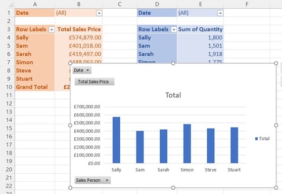
However, the good news is that we can create a Pivot Chart, linked to the Pivot Table, which can often bring the data to life.
Creating a chart from a Pivot Table
1. Select a cell in your Pivot Table.
2. Select PivotTable Tools > Analyse > PivotChart option on the ribbon.
3. Select a chart.
4. Select OK.
A Pivot Chart and Pivot Table are one and the same; therefore, it is impossible to make a change to one without it affecting the other. The difference between them is as obvious as it sounds: one displays the data in a table, and the other in a chart.
Pivot Charts are far simpler to amend and change (drag and drop fields into report areas) than standard charts linked to specific cells. Plus, the Pivot Table also does the summarising job too, removing the need for (complex) formulas.
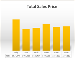
As with Pivot Table Styles, there are some gorgeous Chart Styles that can be simply and easily applied:
We can also have multiple Pivot Charts, but these must be created manually from each specific Pivot Table. The formatting (or style) can be copied from one chart to the other – highlight the outside edge of the chart to copy, press Ctrl + C, then highlight the outside edge of the chart to paste, press Ctrl + V:
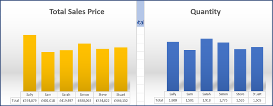
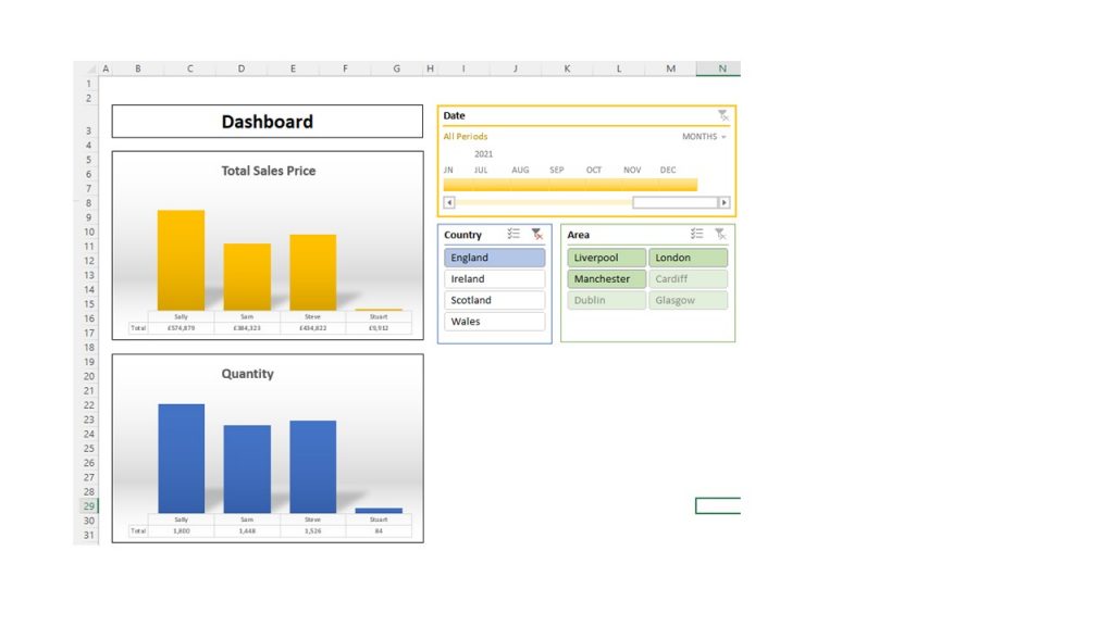
Pivot Charts can also be stored in different sheets to the Pivot Tables but MUST stay in the same file. I usually move them to a separate sheet and build a dashboard of charts:
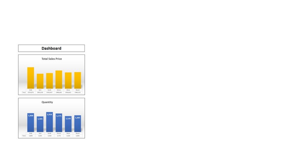
This is a perfect dashboard now, clearly illustrating the Sales Value & Quantity by Sales Person.
The only downside is that if I wanted to select an individual month, I’d need to go back to the sheet with the Pivot Tables and make the change to the filter for EACH Pivot Table – but of course, Excel has another cool trick up its sleeve in the form of Timelines and Slicers.
Timelines and Slicers
These can be found in the ‘PivotTable Analyse’ ribbon.
Timelines
The Timeline must be based on a field that is time- or date-based, and will appear as follows:
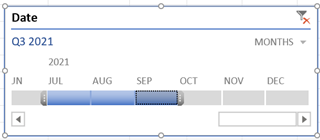
This can be used to select an individual month or a number of months (hold down Shift, or drag the cursor with the three dots at the end).
On the top right, where it currently says ‘Months,’ there is a pick list to alter the timescale to display Years, Quarters, Months or Days without the need for a formula or further calculation.
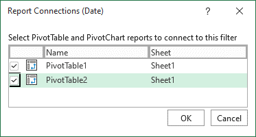
This Timeline will currently ONLY be connected to the Pivot Table that it was initially created from, but it can also be connected to other Pivot Tables (where they are connected to the same raw data), so it can control more than one Pivot Table / Chart. Simply right-click on the Timeline and select ‘Report Connections’ to see the available Pivot Tables:
Slicers
Slicers can be based on any field, and will appear as follows:
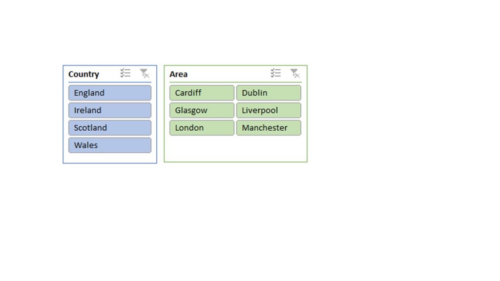
The beauty of Slicers is that they interact with each other, so once a selection is made in one Slicer, it will grey out any irrelevant options in the others, like this:
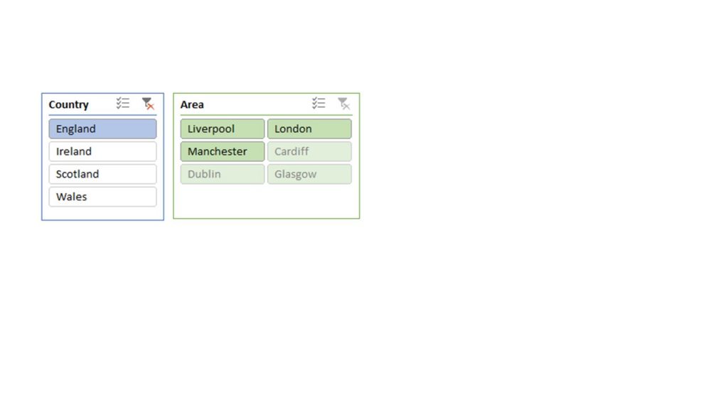
As England has been selected in the Country Slicer, you can see that three of the areas have been greyed out in the Area Slicer, and the relevant areas have been sorted into alphabetical order to make selection easier. This is far simpler to use than filters in the Pivot Table, as you can see the correlation between selections.
Just like Timelines, Slicers can also be connected to multiple Pivot Tables by selecting the relevant Pivot Tables in ‘Report Connections.’
Both Timelines and Slicers will have their own ribbons appear when they are selected, and there are options here for formatting them. Again, this ties in well to help me to use spreadsheets by colour and to communicate to others what they should do, as I can refer to the blue Slicer or the green Slicer.
Finally, I’d always recommend moving the Slicers and Timelines onto the dashboard page (cut & paste) to make controlling the dashboard easier and more visible:


A great write-up. I would like to use it part of my teaching manual with reference (citations)
Hi Adjei,
Please feel free to use part of the article if you wish.
Please reference Traci Williams, Excel Ace (www.excelace.co.uk).
Many Thanks
Traci